Tuesday, 5 April 2011
Evaluation Questions
In what ways does your media product use, develop or challenge from and conventions of real media products?
In order to know and indentify the forms and conventions of real media products-music video, I decided that I should analyse numerous music videos from different eras. The music videos within these different eras are the iconic Michael Jackson’s Thriller, Madonna’s Like a Prayer, Lady Gaga’s Telephone and Biffy Cylro’s Mountains. From analysing these real media products helped me to indentify all different forms and conventions in which can be involved within music videos. Then I then developed the forms and conventions that I identified in my own media products.
Conventions of the lyrics within the song of my music video helped with the mood in which the actress in the music video feels. The lyrics “It’s in the water, from where you came from, where you came from” relates to her ‘finding’ what she is looking for. Indie rock is a very symbolic genre, and whilst researching into real media products relating to indie rock, the sense of ‘mood’ was very strong, whether it was involving a female or male. When the female acts within my music video, she uses no facial expressions, in which reflects on a typical indie rock convention.

The images above show the simarlity bewtween my music video and a really media product relfecting on mood.

Relating to the mood, my music video favours this particular convention. This is shown by the image belowagainst a real media product :

With the left image (snap shot from my music video) I involved two conventions, in which are:
- Dull colours
- Extreme close ups

This is an example of the 'fade' technique, in which I done on Sony Vegas which was used within my music video, Radioactive. By this you can see the two scenes merged together for approximately just under a second before the next scene comes fully into focus and plays out.
My music video developed the convention of genre, as there is included within my music video an independent female character, this links in with female dominance. This particular point subverts the typical forms and conventions, due to that the male is normally the one that dominates overall.
Although I did challenge the codes and conventions of real media products, I ensures that I would not challenge them too far, as the overall media product will not be successful.
How effective is the combination of your main product and your ancillary texts?
The brief in which was given to me stated that we had to produce two ancillary tasks along with our main tasks. From choices, I decided that I would create a digipak cover and a magazine music advertisement because I felt that these two tasks relate to each other well. I wanted a simple image for both the magazine advertisement and the digipak. I took some photos of Katie (female featured within my music video) to see which one was most suitable for a media product. Although this image doesn’t appear within my music video, the females resembles this well.

I then played around with the photos I took to see which one was the most suitable for my ancillary tasks. I then decided on the image below as this picture captured he conventions more due to my research in existing media products. Once I chose the best suitable photo, I then changed it in effect to make it look more professional.

When it came to producing and deciding on the fonts for the ancillary tasks, I needed a font that will attract my target audience’s attention, however also suiting my theme of my music video. Indie rock is considered as unique, within my research there was a lot of contrast fonts, this I why I included italic and simple, to give of this specific effect. There is a website that especially does fonts, Dafont.com. The fonts that I found upon this site, where the best suited for my digipak and music advertisement, in relation to my music video.
Once I had chosen the design of font that I we wanted to use. I then needed to decide on the overall colours for both the digipak/magazine advertisement and the fonts. The colour themes within my music video appeared to be dark colours, including mostly black, so I incorporated this into our ancillary tasks, for association. For my digipak, the main colours are black, blue an red, I have also incorporated the colour black, blue and red within my music video, this is in recognition with the sky, her clothing and the colour adjustment of black and white.
What have you learned from your audience feedback?
The first audience that gave me feedback was from my two media teachers when I had completed the draft of my music video. Firstly I decided on have a much more greater storyline within the video, however my media teacher suggested that more abstract scenes are different and interesting.
To maintain audience feedback I made a large showing for a wider audience, where I got members of my media class and year group to watch the music video and complete a questionnaire. I decided on this method of audience research and feedback as my audience will be able to watch my music video so they can get a good intake before answering and giving feedback on the questionnaires.
Here is my media class and some of my year group watching my music video, whilst completing my questionnaire:


The members of my media class and my year group within the audience of the showing of my music video were in my target audience. Therefore their opinions would be relevant to me whilst producing my music video. Whilst the screening of my music video was over and all the questionnaires were completed, I spoke to the audience to gather guidance and advice. The audience was a lot of help, more so that some were media students so they know what can be improved, what can’t and what can be added in addition to improve my music video to the best of its ability.
Another method that I used of audience feedback was done through using a social networking website- Facebook. I posted the link of my music video on this social networking site and asked people to give me feedback, such as what they thought honestly of my music video, this included, positives, negatives and what can be improved.
Here is an example:

The audience feedback that I gathered was a vital part within this portfolio. Because of audience feedback, it helped me to be able to ensure that my music video can get to a high standard and corrections can be made in order to do so. By having an audience they can easily see what needs improving (especially on a wide large screen), therefore I could gain knowledge on how to make my music video look more professional, in order to appeal to the audience in a more effective way.
How did you use media technologies in the construction, research, planning and evaluation stages?
Throughout this advanced portfolio, I used a numerous amount of different technologies, therefore I was ensured that my products were finished in a high standard. In order to finish products within this portfolio I had to use different media technologies, some of which I was familiar with. The technologies that I haven’t worked on before helped me gain new skills and abilities within media.
Within the development of both my storyboard and digipak, I included slideshows uploaded and created by Photobucket. This website allowed me to created slideshows in which was relevant to my research. The slideshows included the development of how I created the storyboard and the stages of developing my digipak.

Throughout the research and planning stage of this coursework, I was using simple technology such as YouTube. From this I was able to analyse codes and conventions of music videos in which helped me gather relevant and important information in order to produce a good overall media product. By this I developed and challenged within my own media product, this also gave me some good potential ideas when I was planning. Also YouTube allowed me to compose my music video as a file to an actual video that then could be applied into my blog. This was simple as YouTube has a linked labelled ‘embed’ in which ensures that the HTML can be composed to a video when transferring to the blog.

During the type up of my posts, I used Word processor, in which made it easy to look through my work and created my cast list production schedule, etc.

The website ‘KwickSurveys’ helped me to create an online questionnaire which had no restrictions on how many questions are answerers you can have. Creating this questionnaire gave me the understanding and knowledge about my target audience of how they access music and what type of videos they enjoy watching. I posted a link of the questionnaire that I produced to my target audience over the internet so I can get relevant results. The results were displayed as bar charts, this was a great benefit as it was simple and easy to read and understand. I then used this questionnaire and results in order to gather information to help me produce a specific theme and to generate ideas for my music video.


When it came to editing, I used the programme Sony Vegas Pro 8. This programme was one that I wasn’t familiar with, however I gained experience with this and developed my media ability in skills. Sony Vegas Pro 8 has a wide variety of options in which make a product look professional.

The internet was another technology in which I used all the time throughout my coursework, such as researching. However if I didn’t have access to the internet I wouldn’t of been able to present my work on a blog, or have good vital research. I think that the internet was the most important media technology that I have used within this coursework, due to the internet having a wide variety of sources relating to my work.

Paint.net was the programme in which I created both ancillaries on; digipak and magazine advertisement. This programme was fairly advanced and ensured me to be able to produce a high standard media product overall. This programme involved different techniques in which can be applied to my ancillaries such as the old fashioned picture effect – within the TV of my digipak, and the shadowing on my magazine advertisement. Paint.net allowed me to focus on the high quality of my media products with the completion of colours, effects and edits.
Problems that occurred and how did I solve them
A problem in which occurred a considerable amount of times was that Sony Vegas kept on closing and restarting itself, whilst sometimes not auto saving what I had edited. An error message would occur whenever I opened Sony Vegas and try to save my work. Sony Vegas does auto save work, however because of the programme not working correctly, my work was wiped. Fortunately this was an early stage of editing, therefore my whole music video, completed and edited was corrupted.

The above error message would appear when the programme was not working. This made the whole screen blank, therefore not being able to quickly save my work before the programme closed all together. There were options once the error message stop, these where; Restart the programme, what for programme to respond or close programme. Restarting the programme was the best choice as when Sony Vegas doesn’t work properly, it take a considerable amount of time to respond, mainly because of all the KB’s within the programme itself.
To overcome this problem I searched over the internet what can be done in order for this error message not to appear again. People that were having the same problem posted over the internet hoping that someone that does now how to solve the problem we get in touch. I found an answer to the post in which seemed to work. The answer stated that if you press ctrl+ shift+ w on the keyboard, although this made the images not show within the clips, the clips where still there and can be saved with no hassle.
This solved the problem that kept on occurring whilst I was editing and I had no sign of the error message again whilst I was both rendering and editing my music video.
Another problem that occurred affected my time dramatically on finishing my music video, this happened at the construction stage. Whilst I was filming the record button on my video camera was getting stuck. This problem was so simple, however whilst filming I did not realise that the video camera wasn’t recording properly because of the record button not switching on firmly.

Due to not realising that half of what I thought I filmed didn’t record, I had to redo some filming. To prevent too much time waste, the footage that I managed to get I edited, and then saved this on Sony Vegas as a draft in order for me to be able to edit and add clips in at a later stage.
Once I edited the footage that I had already, I filmed some more, redoing the parts that didn’t manage to record properly.
Sunday, 16 January 2011

Creating my music magazine advertisement
Design for my music magazine advertisement:

I developed an idea for my music advertisement on paper so what I can have an idea of what I want the music advertisement to look like before I actually starting producing it.
To come up and create this mock-up I followed the conventions of music advertisements that I had researched in so I can make sure that my advertisement included everything it a magazine advert should.
At the very bottom of the mock-up I included a little sketch of ‘shadowing’. I decided that this effect would have a great deal of affect upon the overall look of the advertisement. Also including the shadowing (dark from the bottom, light at the top) the text could be seen more clearly.
This point leads into a typical convention of indie rock music advertisements, due to that the majority of indie rock music advertisements have a dark colouring. The text:

The main text is the same text for the title on my digipak. By this the association from the digipak to the music advertisement is clear, this would mean that the audience can easily associate and come in recognition with promotion and distribution of the band’s new album. I decided on these fonts as they are eye-catching in which appeals more towards the audience. The contrast between the italic front and the simple font gives off a unique feel, reflecting on the whole symbolic sense of indie-rock.

The ‘brilliant’ quote from HMV I wanted to have small so it doesn’t over power the image and text. Although the rating is important t I didn’t want that particular image to be large, however including a bold colour will stand the rating stars out.

The ‘out now’ text is shown in capitals and is created in a very bold text. This is because it is important for the audience to see when the digipak is out. This text is placed over the digipak itself having a contrast in colour with the background colour. This text is done in ‘Arial’ a really basic front. I chose this front as it is the easiest font to read when text is small; this font is what I also typed up in copyright.

The HMV text is exactly what their company logo is; this is very popular in advertisements as the font is what makes the logo its own. I’m including a positive quote from a music store to represent the digipak as ‘Brilliant’.
Imagery:

The four stars resemble the rating of the digipak. I am aiming for the background to be dark, therefore I decided on displaying red stars as they are clear and stand outs to catch the viewer’s eye.

This image is also included in my digipak. Whilst researching into digipaks and advertisements, the same images are included, by this there is more association and recognition with the products. When developing my advertisement further on Paint.net I will change this image so it fits more portrait and add the effect of shadow.
Research of magazine music advertisements related to my music genre, Indie rock:

Even though it is quite a dull overall advertisement the colours still are strong within the image and text located at the bottom. The main colours are white, red and blue, representing the country’s flag, it gives off a mild military feel.
The text ‘Kasabian’ is simple, but yet effective, this is because it stands out and is in a font that is easy to read in which is eye catching. The text below Kasabian ‘West west Ryder pauper lunatic asylum’ which is the name of the album is done in a font which looks old English style, which refers to the genre of sort of ‘retro’. The image is sectioned off with a cardboard colour which stands behind the text. This is a good effect as it makes the image more appealing at stand out, also the colour red will not appear clearly if on the image.

The Editors music advertisement is differently unique, as the advertisement does not include images of the band members (in which is very popular) and contains art work. Firstly I thought that the art work was of sound waves than I looked closely and saw buildings and hills. The main thing that made me think that the image was of sound waves is because of the colours, which is effective. There are two images which are not that popular on advertisements as there could be too much making the advertisement crowded, however the lack in over done font balances this.
The text is very simple, the text stands out from the image and background as they are in a contrast of colours. However there is a considerable amount of text, although the majority is in a very small font, therefore it isn’t distracting from the artist’s and album name title.
The overall advertisement is appealing towards the audience as it contains are large amount of art work, its simple and also bold.

Fyfe Dangerfield’s music advertisement straight away gives off a good impression. Although the artist is dressed in part, sort of like a black it is not a typical indie rock image due to the bright colours. With the image is a web message telling you that the main single is included within this album, which is effective due to the photo that comes with the message is linked with the main advertisement image. The image looks like a natural pose which is not used in advertising that much.
The text is very well used and ties in well with the image. The words in the sky are outlined in flowers and the words in the flowers are outlined in the sky.
Research of magazine music advertisements
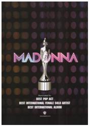 This music advertisement promoting Madonna is very effective, it brings out and shows feminine characteristics.
 The advertisement has a ‘disco feel’ to it, which relates to the genre, pop, you can see this as the background contains a pattern that seems similar to disco lights.
The text is very bold in both the artists name and the text below. The text below includes information about the album and the companies involved. The text is white against a black background to make it eye catching. The text ‘Madonna’ also indicates the disco feel as the name itself looks lit up like lights, especially inducing the effect of two different tones.
The image refers to winning, as it looks like an award of some kind. The image is grey so it does stand out from the background and text. Also it is edited to look reflective and valuable.
The overall advertisement is simple but effective. Simple advertisements are more understanding and easy to read.

This particular music magazine advertisement referring to The Verve is very successful in a way that it’s simple but provokes a mood within the image. The image is the effect of the grey scale making the overall image look old fashioned, especially because of the location.
The edits between the contrasts of light to dark colours shows the rich effect against the text. The text is very effective as there are different fonts used. The text of the artist name, The Verve is in a simple text with no capital letters, however the text below mentioning the single name, Love is Noise is in a different font in capital letters. Even though the single name is in capitals in does not over impact the artist name due to the different size fonts.
The overall presentation of the advertisement is not colourful, however the editing with the grey scale over comes this.

Ellie Goulding’s music advertisement overall is one of the most popular layouts. The artist being included is really popular. The image takes up a considerable amount of space on the ad.
Lots of editing has been used, you can see that editors have darkened the bottom of the ad so the text would show, against in contrast of colours, and the glitter running through her hair has been added, which is a good effective as it relates to the text and colouring. The gold colour of the advertisement most properly links and indicates her name ‘Goulding’.
The text is done very cleverly. The album name is called ‘Lights’ and the text is done and appears like lights glowing, in which is very successful towards the ad for appealing and withdrawing the audience.
Conventions of a music magazine advertisement
Ø The name of the artist
Ø Name of the album or single
Ø When the album or single is out to purchase in stores
Ø Image of the album or single cover or image of the artist
Ø The record company
Ø Reviews and ratings
Subscribe to:
Posts (Atom)