Sunday 16 January 2011

Creating my music magazine advertisement
Design for my music magazine advertisement:

I developed an idea for my music advertisement on paper so what I can have an idea of what I want the music advertisement to look like before I actually starting producing it.
To come up and create this mock-up I followed the conventions of music advertisements that I had researched in so I can make sure that my advertisement included everything it a magazine advert should.
At the very bottom of the mock-up I included a little sketch of ‘shadowing’. I decided that this effect would have a great deal of affect upon the overall look of the advertisement. Also including the shadowing (dark from the bottom, light at the top) the text could be seen more clearly.
This point leads into a typical convention of indie rock music advertisements, due to that the majority of indie rock music advertisements have a dark colouring. The text:

The main text is the same text for the title on my digipak. By this the association from the digipak to the music advertisement is clear, this would mean that the audience can easily associate and come in recognition with promotion and distribution of the band’s new album. I decided on these fonts as they are eye-catching in which appeals more towards the audience. The contrast between the italic front and the simple font gives off a unique feel, reflecting on the whole symbolic sense of indie-rock.

The ‘brilliant’ quote from HMV I wanted to have small so it doesn’t over power the image and text. Although the rating is important t I didn’t want that particular image to be large, however including a bold colour will stand the rating stars out.

The ‘out now’ text is shown in capitals and is created in a very bold text. This is because it is important for the audience to see when the digipak is out. This text is placed over the digipak itself having a contrast in colour with the background colour. This text is done in ‘Arial’ a really basic front. I chose this front as it is the easiest font to read when text is small; this font is what I also typed up in copyright.

The HMV text is exactly what their company logo is; this is very popular in advertisements as the font is what makes the logo its own. I’m including a positive quote from a music store to represent the digipak as ‘Brilliant’.
Imagery:

The four stars resemble the rating of the digipak. I am aiming for the background to be dark, therefore I decided on displaying red stars as they are clear and stand outs to catch the viewer’s eye.

This image is also included in my digipak. Whilst researching into digipaks and advertisements, the same images are included, by this there is more association and recognition with the products. When developing my advertisement further on Paint.net I will change this image so it fits more portrait and add the effect of shadow.
Research of magazine music advertisements related to my music genre, Indie rock:

Even though it is quite a dull overall advertisement the colours still are strong within the image and text located at the bottom. The main colours are white, red and blue, representing the country’s flag, it gives off a mild military feel.
The text ‘Kasabian’ is simple, but yet effective, this is because it stands out and is in a font that is easy to read in which is eye catching. The text below Kasabian ‘West west Ryder pauper lunatic asylum’ which is the name of the album is done in a font which looks old English style, which refers to the genre of sort of ‘retro’. The image is sectioned off with a cardboard colour which stands behind the text. This is a good effect as it makes the image more appealing at stand out, also the colour red will not appear clearly if on the image.

The Editors music advertisement is differently unique, as the advertisement does not include images of the band members (in which is very popular) and contains art work. Firstly I thought that the art work was of sound waves than I looked closely and saw buildings and hills. The main thing that made me think that the image was of sound waves is because of the colours, which is effective. There are two images which are not that popular on advertisements as there could be too much making the advertisement crowded, however the lack in over done font balances this.
The text is very simple, the text stands out from the image and background as they are in a contrast of colours. However there is a considerable amount of text, although the majority is in a very small font, therefore it isn’t distracting from the artist’s and album name title.
The overall advertisement is appealing towards the audience as it contains are large amount of art work, its simple and also bold.

Fyfe Dangerfield’s music advertisement straight away gives off a good impression. Although the artist is dressed in part, sort of like a black it is not a typical indie rock image due to the bright colours. With the image is a web message telling you that the main single is included within this album, which is effective due to the photo that comes with the message is linked with the main advertisement image. The image looks like a natural pose which is not used in advertising that much.
The text is very well used and ties in well with the image. The words in the sky are outlined in flowers and the words in the flowers are outlined in the sky.
Research of magazine music advertisements
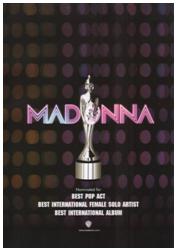 This music advertisement promoting Madonna is very effective, it brings out and shows feminine characteristics.
 The advertisement has a ‘disco feel’ to it, which relates to the genre, pop, you can see this as the background contains a pattern that seems similar to disco lights.
The text is very bold in both the artists name and the text below. The text below includes information about the album and the companies involved. The text is white against a black background to make it eye catching. The text ‘Madonna’ also indicates the disco feel as the name itself looks lit up like lights, especially inducing the effect of two different tones.
The image refers to winning, as it looks like an award of some kind. The image is grey so it does stand out from the background and text. Also it is edited to look reflective and valuable.
The overall advertisement is simple but effective. Simple advertisements are more understanding and easy to read.

This particular music magazine advertisement referring to The Verve is very successful in a way that it’s simple but provokes a mood within the image. The image is the effect of the grey scale making the overall image look old fashioned, especially because of the location.
The edits between the contrasts of light to dark colours shows the rich effect against the text. The text is very effective as there are different fonts used. The text of the artist name, The Verve is in a simple text with no capital letters, however the text below mentioning the single name, Love is Noise is in a different font in capital letters. Even though the single name is in capitals in does not over impact the artist name due to the different size fonts.
The overall presentation of the advertisement is not colourful, however the editing with the grey scale over comes this.

Ellie Goulding’s music advertisement overall is one of the most popular layouts. The artist being included is really popular. The image takes up a considerable amount of space on the ad.
Lots of editing has been used, you can see that editors have darkened the bottom of the ad so the text would show, against in contrast of colours, and the glitter running through her hair has been added, which is a good effective as it relates to the text and colouring. The gold colour of the advertisement most properly links and indicates her name ‘Goulding’.
The text is done very cleverly. The album name is called ‘Lights’ and the text is done and appears like lights glowing, in which is very successful towards the ad for appealing and withdrawing the audience.
Conventions of a music magazine advertisement
Ø The name of the artist
Ø Name of the album or single
Ø When the album or single is out to purchase in stores
Ø Image of the album or single cover or image of the artist
Ø The record company
Ø Reviews and ratings
What is an advertisement?
Advertising can provide and to communicate an idea to a large number of people in an attempt to convince them to take a certain action. Advertising is a form of communication is produced to persuade an audience to purchase or take some action upon products, ideas, or services. It includes the name of a product and how that product could benefit the consumer, to persuade a target market to purchase or to consume that particular brand. These messages are usually paid for by sponsors and viewed via various media.
Advertising music uses a lot of media, including TV, magazine, radio and newspaper advertisements. TV is the main successful type of media towards advertising because it’s more viewable than just a radio and includes images, part of the song so you can actually hear it and be able to view part of a music video from the artist.
Advertising music uses a lot of media, including TV, magazine, radio and newspaper advertisements. TV is the main successful type of media towards advertising because it’s more viewable than just a radio and includes images, part of the song so you can actually hear it and be able to view part of a music video from the artist.
Magazine advertisements are also effective due to that they contain a lot of information towards the audience. Magazines promote a product very successfully because it shows not just information about it but visual impact.
Final design of my digipak
The front, back cover, inside image and side strip:
 Inside image Back cover Side strip Front cover
 The front and back cover is exactly the same layout from my mock-up. I played around with the colours and image effects whilst on Paint.net. The Sony music record label needed to be pacifically at the bottom otherwise it would not be seen against the red entertainment curtains. The background colour on the covers makes a good contrast between the central image on the front cover and the red entertainment curtains on the back cover. Having the text central makes the overall digipak look authentic and more interesting. The image in the TV is done to make it look like it was filmed/taken in the 60’s, I used different types of effects to get the right one. Especially with the light bulb above her head had to blend in the TV image and the colouring. The side strip is done with the same font used on the front cover. As every CD has a tracking number I researched in where the tracking number goes by seeing my collection of CD/Digipaks. I noticed that they go on the CD itself and the side of the case where it’s easy to see. On the side strip I added the tracking number at the end as I realised I had forgotten to mention it in my mock-up, however because it is vital towards a CD I had to included it, and it is only small text to involve so it didn’t dysfunction my layout. In my mock-up of the inside image, I sketched in shadowing for the effect upon the image, however I found a useful website called FotoFlexer in which allowed me to see the image in any effect. The effect that I thought was the most suited for the digipak and made it look more unique was the ‘patchwork’ effect. The gives the images overall look more exciting and interesting, in which gives off a unique feel and adds a distinctive and exclusive sense too the digipak, especially because it is a definitive edition.
Inside, CD 1 and CD 2:


The inside of the digipak is set out into three sections including
1) The band members names and what instrument they play; The official website of Kings Of Leon ,
people that produced the digipaks main elements such as editors, photographers, copyright
2) CD 1
3) CD 2
The old fashioned vintage pattern as the background of CD 1 and CD 2 gives off an old fashion feel, relating to the old style TV on the front cover. Most indie-rock bands do reflect old fashion styles in their designs in CD artwork. I tried different colours when inserting the pattern, I decided on a light black and white effect in which stands effectively against the two CDs. With the two CDs I created them in two contrasting colours in which makes the overall look more interesting and unique. The very left inside panel includes the band member’s names and what instrument they play. I was going to included images, however I thought that this would make the inside to crowed as I have included a large image on the middle panel when digipak is opened. Therefore having different sized text will make it appealing without imagery. The copyright includes the copyright logo (©) and all the information needed. Also including websites such as their official- www.kingsofleon.com. Again I designed it with the same font , however with the small print and the bottom used for websites and designers, editors and photographers, etc, I used a basic front (Arial) so it would be clear to understand. The text is all done in black as it is a good contrast from the colour of the background and images used within the whole digipak.
Insert:

I used the same colour background as the front cover as I wanted to match as many colours as possible, however at the same time trying not to make it look uninteresting. First of all I entered all the text left of the textbox, however I changed the text central as I thought it looked more appealing to read and made the inset look less crowed. The imagery that Included gives more interest, although the images; records and an amp are black and the background colour light blue it makes the inset look more effectual.
Creating my digipak
Design for my digipak.

On the front cover I developed the ‘Kings of Leon’ text to small font in which is central so it looks more included with the image. When on the programme Paint.net I would have to make the font smaller as because it’s central I want the text to stay underneath the television, but not be distracting from the image. As you can see with this mock-up image I added a light bulb above Katie’s head. I created this idea because looking back through my research and planning I mentioned within the synopsis that she is thinking in depth as she is walking. The light bulb relates to an idea.
The back cover I thought would be interesting if I involved something that is unique but still relating and reflecting on the music industry, red entertainment curtains. This will add colour to the overall look and will bring in viewers.
Also when on the programme paint.net, I will include the record label; Sony music and a barcode on the back cover.
The inset image is of Katie, who is from the music video and is involved in the front cover. Her face is going to the main image, including a shadow effect. Throughout studying digipaks that I have in my home collection, I found that album artwork is very effective within a digipak.

I have included two CD’s that the digipak will be providing.
CD 1:
Ø Songs of the album ‘Radioactive’
CD 2:‘definitive edition’
Ø Interview with the band, Kings of Leon
Ø Music video of Radioactive
The CD’s are against a vintage old fashioned background, in which relates to the old fashion TV on the front cover. Most Rock Indie bands don’t follow the ‘modern’ look.


The left hand side contains the band’s name ‘Kings Of Leon’ and the writing underneath (centred in the middle) contains the band members and what instrument they play.
Below sectioned off at the very bottom of the left section contains:
Ø The official website of Kings Of Leon
Ø People that produced the digipaks main elements such as editors, photographers.
Ø Copyright

This is the sketch of the side strip.
This includes:
Ø Artist name: Kings of Leon
Ø Digipak’s name: Radioactive
Ø Catalogue number: BMG85963 (Number for tracing the product, (reference) Sony music=BMG; British Music Group
Insert:

As I researched throughout different types of digipaks, I liked very much an inset. The most popular insert included lyrics, therefore I decided that I should included all lyrics within the digipak ‘Radioactive’ . When on the my chosen media creating programme; Paint.net, I may include some imagery as when on Paint.net I can play around with size and colour.
The image:

I done lots of alternative shots of Katie and picked out the seven that I thought was the better image for my digipak. This includes different angles and head shot positions. The positions included are mid shots and close ups.

I then picked the best one that would fit well into my design. I then thought as she is going to be standing underneath a light bulb, Katie looking up will be a good effect.
With the above image that I chose for my final design I developed it on Paint.net. I looked throughout the effects that could be used. Because of the image is being place inside a television screen I wanted a look that is more antique.

Above you can see the contrast from before I edited the image and after. I used the focal black and white effect, so the light bulb will shine more down towards Katie and the effect cross process cinematic look.

I then placed the finished edited image into the television for the central image of the front of my digipak (above). I used layers to combine the images together, which helped create the overall image seem realistic.
The text:
I am going to research into different types of font to see which one suits my digipak style better.
(For the front cover)

I prefer the second font- 
I am going to use this font because in my mock ups above I mentioned that I want a simple bold font, therefore I chose this as it is exactly what I wanted for my digipak front cover. This font is easy to read and eye catching.

From my mock-ups I wanted an italic font, this one of the reasons why I chose this particular font. Other reasons being that it ties in well with the vintage theme and it is a complete contrast between the album title- radioactive’s font, in which I prefer them both to be different from one another because each stand out to their own.
**Paint.net is an open source version of Photoshop. It is a programme with a combination of paint, Photoshop and Freehand**
Below is a print screen showing the effects that could be used:

Digipaks related to my music genre (indie rock)

The text is an effective style in which goes well with the imagery, even though the image is colourful along with the text, the text still stands out. With this particular text and imagery overall the cover is vibrant and indicates a happy mood. However the word ‘Odd’ in the album title suggests that the tracks included within the CD are, and the cover releases a feel that it is not ‘normal’.
This cover does not have the name of the artist included which could make people want to find out who it is by, therefore fans could increase by finding a new artist that they enjoy listening too. However this could also be confusing as it is not clear.

The text is an effect which looks hand drawn, both the artists name and the album name. The only bold colour that applies to this digipak is the bright blue text ‘Plain White T’s’, this is eye catching as it is also outlined in black. The album name text is in a completely different font. It’s italic, also the letters are not all the same size, which contributes to the ‘homemade feel’.
The image is what makes the overall digipak stand out more than others. The majority of artists like their image to be of them in a very professional pose and presented in a model way.

Again this front cover does not have the artists name on it so the audience do not know who the artist is, but the album name is bold in white in which it looks like it has be applied with paint against a colour background. The coloured background looks like a painting, it has a rich effect of bold colours and is a very effective background. The main colour that seems to stand out is the red flag. Red symbolises danger and death, however it is also a warm colour and sometimes represents love.

The cover doesn’t included an album title, however the half of the digipaks produced are named after the artist’s name.

This digipak; Scream by Chris Cornell releases a good vibe as the image is very energetic. The image is darker than the background so it really stands out. The male on the cover is Chris Cornell himself which is very popular.
The editing is very successful and effectual because the lighting is around the artist which stands the image out, so it’s effective that there’s a contrast in colour from the background to the figure image.
The text is very bold, and also the text is vertical which is unusual. However the vertical text benefits the image as the image takes up a considerable amount of room. The artists name ‘Chris Cornell’ is bolder and larger than the album name ‘Scream’ this is good in effective of audience attention.
Research on digipak covers

I’ am researching throughout the different genres dissimilar to my music video (indie-rock) because I want to get a general idea on how each cover labels and represents its genre. This is because I want my digipak cover to have the correct and understandable reference to the music itself. There is a large difference between the digipak covers from the image above. I am going to chose to, to research just a brief description into them so I can get a rough idea.
I picked out two artists with a different image and feel to the cover, Katy Perry and The Jonas Brothers.
Katy Perry (1st middle) and The Jonas Brothers (next too). Katy Perry, who is a pop artist in which has flesh showing and hasn’t got a serious feel and the image itself is unrealistic, however the Jonas Bothers is classed as Rock-Pop, also they sound a little old rock such as the musician Elvis Costello, they are posing in a serious way and no considerable amount of editing is used.
Also the colouring is much diverse between them too. Katy Perry has rich colours in which are very vibrant, on the other hand The Jonas Brothers have slightly dull colours, however it is brightened slightly with the white background, but the clothing that they are wearing have made the overall image duller.
Conventions of a digipak
Ø Name of the artist/band.
Ø Album title.
Ø List of tracks on the back cover (could feature a bonus track.)
Ø Artwork- The images that are included, plus the font and colouring of the text.
Ø Record name- The major companies.
Ø Barcode.
Ø Imagery that goes with the music genre- such a rock would be normally contain guitars, drums, etc and colours that are mainly dim.
Ø Logo.
Ø Website.
Ø Production information that is on the inside of the back cover.
Ø (If a band) showing the names of who plays what instrument.
Ø Copyright.
Ø Lyrics, plus linked music video official
Ø Poster
Subscribe to:
Posts (Atom)