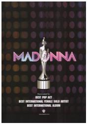
 This music advertisement promoting Madonna is very effective, it brings out and shows feminine characteristics.
 The advertisement has a ‘disco feel’ to it, which relates to the genre, pop, you can see this as the background contains a pattern that seems similar to disco lights.
The text is very bold in both the artists name and the text below. The text below includes information about the album and the companies involved. The text is white against a black background to make it eye catching. The text ‘Madonna’ also indicates the disco feel as the name itself looks lit up like lights, especially inducing the effect of two different tones.
The image refers to winning, as it looks like an award of some kind. The image is grey so it does stand out from the background and text. Also it is edited to look reflective and valuable.
The overall advertisement is simple but effective. Simple advertisements are more understanding and easy to read.

This particular music magazine advertisement referring to The Verve is very successful in a way that it’s simple but provokes a mood within the image. The image is the effect of the grey scale making the overall image look old fashioned, especially because of the location.
The edits between the contrasts of light to dark colours shows the rich effect against the text. The text is very effective as there are different fonts used. The text of the artist name, The Verve is in a simple text with no capital letters, however the text below mentioning the single name, Love is Noise is in a different font in capital letters. Even though the single name is in capitals in does not over impact the artist name due to the different size fonts.
The overall presentation of the advertisement is not colourful, however the editing with the grey scale over comes this.

Ellie Goulding’s music advertisement overall is one of the most popular layouts. The artist being included is really popular. The image takes up a considerable amount of space on the ad.
Lots of editing has been used, you can see that editors have darkened the bottom of the ad so the text would show, against in contrast of colours, and the glitter running through her hair has been added, which is a good effective as it relates to the text and colouring. The gold colour of the advertisement most properly links and indicates her name ‘Goulding’.
The text is done very cleverly. The album name is called ‘Lights’ and the text is done and appears like lights glowing, in which is very successful towards the ad for appealing and withdrawing the audience.
No comments:
Post a Comment