On the front cover I developed the ‘Kings of Leon’ text to small font in which is central so it looks more included with the image. When on the programme Paint.net I would have to make the font smaller as because it’s central I want the text to stay underneath the television, but not be distracting from the image. As you can see with this mock-up image I added a light bulb above Katie’s head. I created this idea because looking back through my research and planning I mentioned within the synopsis that she is thinking in depth as she is walking. The light bulb relates to an idea.
The back cover I thought would be interesting if I involved something that is unique but still relating and reflecting on the music industry, red entertainment curtains. This will add colour to the overall look and will bring in viewers.
Also when on the programme paint.net, I will include the record label; Sony music and a barcode on the back cover.
The inset image is of Katie, who is from the music video and is involved in the front cover. Her face is going to the main image, including a shadow effect. Throughout studying digipaks that I have in my home collection, I found that album artwork is very effective within a digipak.
I have included two CD’s that the digipak will be providing.
CD 1:
Ø Songs of the album ‘Radioactive’
CD 2:‘definitive edition’
Ø Interview with the band, Kings of Leon
Ø Music video of Radioactive
The CD’s are against a vintage old fashioned background, in which relates to the old fashion TV on the front cover. Most Rock Indie bands don’t follow the ‘modern’ look.
The left hand side contains the band’s name ‘Kings Of Leon’ and the writing underneath (centred in the middle) contains the band members and what instrument they play.
Below sectioned off at the very bottom of the left section contains:
Ø The official website of Kings Of Leon
Ø People that produced the digipaks main elements such as editors, photographers.
Ø Copyright
This is the sketch of the side strip.
This includes:
Ø Artist name: Kings of Leon
Ø Digipak’s name: Radioactive
Ø Catalogue number: BMG85963 (Number for tracing the product, (reference) Sony music=BMG; British Music Group
Insert:
As I researched throughout different types of digipaks, I liked very much an inset. The most popular insert included lyrics, therefore I decided that I should included all lyrics within the digipak ‘Radioactive’ . When on the my chosen media creating programme; Paint.net, I may include some imagery as when on Paint.net I can play around with size and colour.
The image:
I done lots of alternative shots of Katie and picked out the seven that I thought was the better image for my digipak. This includes different angles and head shot positions. The positions included are mid shots and close ups.
I then picked the best one that would fit well into my design. I then thought as she is going to be standing underneath a light bulb, Katie looking up will be a good effect.
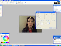
With the above image that I chose for my final design I developed it on Paint.net. I looked throughout the effects that could be used. Because of the image is being place inside a television screen I wanted a look that is more antique.
Above you can see the contrast from before I edited the image and after. I used the focal black and white effect, so the light bulb will shine more down towards Katie and the effect cross process cinematic look.
I then placed the finished edited image into the television for the central image of the front of my digipak (above). I used layers to combine the images together, which helped create the overall image seem realistic.
The text:
I am going to research into different types of font to see which one suits my digipak style better.
(For the front cover)
I am going to use this font because in my mock ups above I mentioned that I want a simple bold font, therefore I chose this as it is exactly what I wanted for my digipak front cover. This font is easy to read and eye catching.

From my mock-ups I wanted an italic font, this one of the reasons why I chose this particular font. Other reasons being that it ties in well with the vintage theme and it is a complete contrast between the album title- radioactive’s font, in which I prefer them both to be different from one another because each stand out to their own.
**Paint.net is an open source version of Photoshop. It is a programme with a combination of paint, Photoshop and Freehand**
Below is a print screen showing the effects that could be used:


No comments:
Post a Comment