Showing posts with label Ancillary Task 2. Show all posts
Showing posts with label Ancillary Task 2. Show all posts
Sunday, 16 January 2011


Creating my music magazine advertisement
Design for my music magazine advertisement:

I developed an idea for my music advertisement on paper so what I can have an idea of what I want the music advertisement to look like before I actually starting producing it.
To come up and create this mock-up I followed the conventions of music advertisements that I had researched in so I can make sure that my advertisement included everything it a magazine advert should.
At the very bottom of the mock-up I included a little sketch of ‘shadowing’. I decided that this effect would have a great deal of affect upon the overall look of the advertisement. Also including the shadowing (dark from the bottom, light at the top) the text could be seen more clearly.
This point leads into a typical convention of indie rock music advertisements, due to that the majority of indie rock music advertisements have a dark colouring. The text:

The main text is the same text for the title on my digipak. By this the association from the digipak to the music advertisement is clear, this would mean that the audience can easily associate and come in recognition with promotion and distribution of the band’s new album. I decided on these fonts as they are eye-catching in which appeals more towards the audience. The contrast between the italic front and the simple font gives off a unique feel, reflecting on the whole symbolic sense of indie-rock.


The ‘brilliant’ quote from HMV I wanted to have small so it doesn’t over power the image and text. Although the rating is important t I didn’t want that particular image to be large, however including a bold colour will stand the rating stars out.

The ‘out now’ text is shown in capitals and is created in a very bold text. This is because it is important for the audience to see when the digipak is out. This text is placed over the digipak itself having a contrast in colour with the background colour. This text is done in ‘Arial’ a really basic front. I chose this front as it is the easiest font to read when text is small; this font is what I also typed up in copyright.

The HMV text is exactly what their company logo is; this is very popular in advertisements as the font is what makes the logo its own. I’m including a positive quote from a music store to represent the digipak as ‘Brilliant’.
Imagery:

The four stars resemble the rating of the digipak. I am aiming for the background to be dark, therefore I decided on displaying red stars as they are clear and stand outs to catch the viewer’s eye.

This image is also included in my digipak. Whilst researching into digipaks and advertisements, the same images are included, by this there is more association and recognition with the products. When developing my advertisement further on Paint.net I will change this image so it fits more portrait and add the effect of shadow.
Research of magazine music advertisements related to my music genre, Indie rock:

Even though it is quite a dull overall advertisement the colours still are strong within the image and text located at the bottom. The main colours are white, red and blue, representing the country’s flag, it gives off a mild military feel.
The text ‘Kasabian’ is simple, but yet effective, this is because it stands out and is in a font that is easy to read in which is eye catching. The text below Kasabian ‘West west Ryder pauper lunatic asylum’ which is the name of the album is done in a font which looks old English style, which refers to the genre of sort of ‘retro’. The image is sectioned off with a cardboard colour which stands behind the text. This is a good effect as it makes the image more appealing at stand out, also the colour red will not appear clearly if on the image.

The Editors music advertisement is differently unique, as the advertisement does not include images of the band members (in which is very popular) and contains art work. Firstly I thought that the art work was of sound waves than I looked closely and saw buildings and hills. The main thing that made me think that the image was of sound waves is because of the colours, which is effective. There are two images which are not that popular on advertisements as there could be too much making the advertisement crowded, however the lack in over done font balances this.
The text is very simple, the text stands out from the image and background as they are in a contrast of colours. However there is a considerable amount of text, although the majority is in a very small font, therefore it isn’t distracting from the artist’s and album name title.
The overall advertisement is appealing towards the audience as it contains are large amount of art work, its simple and also bold.

Fyfe Dangerfield’s music advertisement straight away gives off a good impression. Although the artist is dressed in part, sort of like a black it is not a typical indie rock image due to the bright colours. With the image is a web message telling you that the main single is included within this album, which is effective due to the photo that comes with the message is linked with the main advertisement image. The image looks like a natural pose which is not used in advertising that much.
The text is very well used and ties in well with the image. The words in the sky are outlined in flowers and the words in the flowers are outlined in the sky.
Research of magazine music advertisements
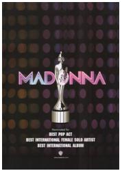 This music advertisement promoting Madonna is very effective, it brings out and shows feminine characteristics.
 The advertisement has a ‘disco feel’ to it, which relates to the genre, pop, you can see this as the background contains a pattern that seems similar to disco lights.
The text is very bold in both the artists name and the text below. The text below includes information about the album and the companies involved. The text is white against a black background to make it eye catching. The text ‘Madonna’ also indicates the disco feel as the name itself looks lit up like lights, especially inducing the effect of two different tones.
The image refers to winning, as it looks like an award of some kind. The image is grey so it does stand out from the background and text. Also it is edited to look reflective and valuable.
The overall advertisement is simple but effective. Simple advertisements are more understanding and easy to read.

This particular music magazine advertisement referring to The Verve is very successful in a way that it’s simple but provokes a mood within the image. The image is the effect of the grey scale making the overall image look old fashioned, especially because of the location.
The edits between the contrasts of light to dark colours shows the rich effect against the text. The text is very effective as there are different fonts used. The text of the artist name, The Verve is in a simple text with no capital letters, however the text below mentioning the single name, Love is Noise is in a different font in capital letters. Even though the single name is in capitals in does not over impact the artist name due to the different size fonts.
The overall presentation of the advertisement is not colourful, however the editing with the grey scale over comes this.

Ellie Goulding’s music advertisement overall is one of the most popular layouts. The artist being included is really popular. The image takes up a considerable amount of space on the ad.
Lots of editing has been used, you can see that editors have darkened the bottom of the ad so the text would show, against in contrast of colours, and the glitter running through her hair has been added, which is a good effective as it relates to the text and colouring. The gold colour of the advertisement most properly links and indicates her name ‘Goulding’.
The text is done very cleverly. The album name is called ‘Lights’ and the text is done and appears like lights glowing, in which is very successful towards the ad for appealing and withdrawing the audience.
Conventions of a music magazine advertisement
Ø The name of the artist
Ø Name of the album or single
Ø When the album or single is out to purchase in stores
Ø Image of the album or single cover or image of the artist
Ø The record company
Ø Reviews and ratings
What is an advertisement?
Advertising can provide and to communicate an idea to a large number of people in an attempt to convince them to take a certain action. Advertising is a form of communication is produced to persuade an audience to purchase or take some action upon products, ideas, or services. It includes the name of a product and how that product could benefit the consumer, to persuade a target market to purchase or to consume that particular brand. These messages are usually paid for by sponsors and viewed via various media.
Advertising music uses a lot of media, including TV, magazine, radio and newspaper advertisements. TV is the main successful type of media towards advertising because it’s more viewable than just a radio and includes images, part of the song so you can actually hear it and be able to view part of a music video from the artist.
Advertising music uses a lot of media, including TV, magazine, radio and newspaper advertisements. TV is the main successful type of media towards advertising because it’s more viewable than just a radio and includes images, part of the song so you can actually hear it and be able to view part of a music video from the artist.
Magazine advertisements are also effective due to that they contain a lot of information towards the audience. Magazines promote a product very successfully because it shows not just information about it but visual impact.
Subscribe to:
Posts (Atom)